- Our Services
Brand Identity
Website Design
Print Media
Brand Identity
Website Design
Print Media
Packaging Design
- Pricing
Brand Identity
Website Design
Print Media
Brand Identity
Website Design
Print Media
Packaging Design
- Portfolio
- About Us
- Our Team
- Our Reviews
- Blogs
The History and Evolution of the Disney Logo: Lessons for Business Logo Design
The Disney logo is more than just a recognizable symbol; it’s a story told through design. For decades, Disney has been a giant in entertainment, and its iconic logo reflects this legacy. But Disney’s logo hasn’t always looked the way it does today. From simple beginnings to its magical transformation, Disney’s logo is a masterclass in brand evolution. For business owners considering a logo for their brand, the journey of Disney’s logo holds valuable lessons in adapting, storytelling, and capturing timeless appeal.
The Early Days: Humble Beginnings (1920s-1930s)
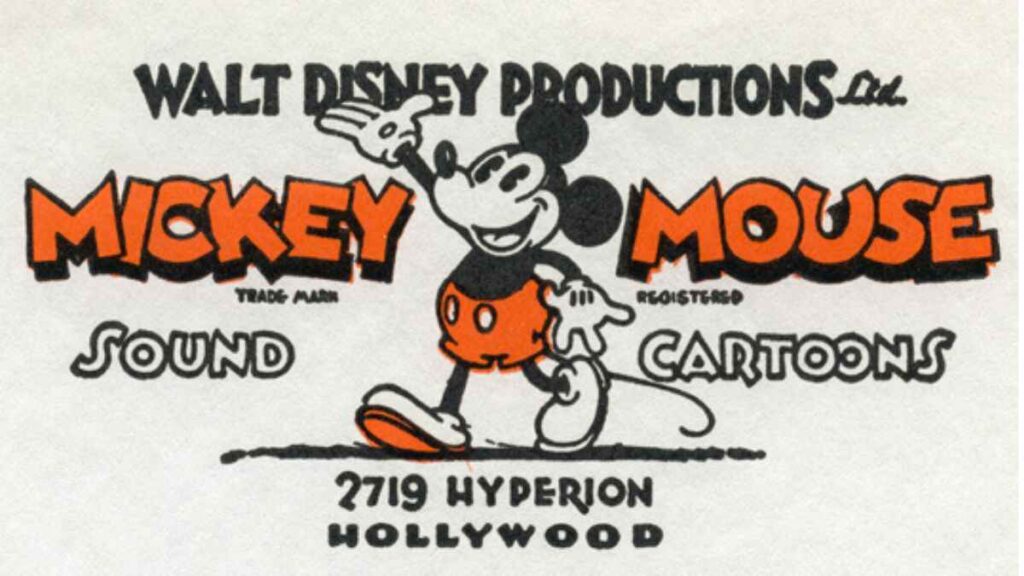
Disney’s logo journey began in 1923 when Walt Disney and his brother, Roy, founded Disney Brothers Studio. Initially, there wasn’t a specific logo for the company; the focus was on creating short films. However, in 1929, with the release of Steamboat Willie, the first cartoon featuring Mickey Mouse, Disney created an early version of a logo that featured Mickey as a representative of the brand. This simple character-based emblem marked the brand’s playful spirit, something that would stay core to Disney’s identity.
For business owners, this phase underscores the importance of beginning with a foundation that reflects the core essence of the brand. Logos don’t have to be flashy or complex at first, as long as they resonate with the company’s values and target audience.
The Walt Disney Signature Logo (1940s-1970s)
In the 1940s, Disney introduced the classic “Walt Disney” signature as its logo. This handwritten font became synonymous with the company and was used extensively across films, cartoons, and merchandise. The choice of a signature-based logo was intentional—it offered a personal connection between Walt Disney and his audience, building trust and familiarity.
Key Takeaway: A personal touch in logo design can be very powerful, especially for smaller businesses where founders play a visible role. A signature-style logo is often perceived as more approachable, which can build a stronger connection with customers.
Adding the Magic: The Castle (1980s-2000s)
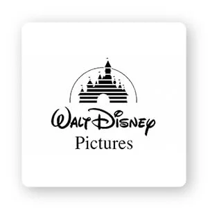
Disney added an enchanted element to its logo in the 1980s with the introduction of Cinderella’s castle. This castle became iconic, appearing at the beginning of Disney films and eventually evolving into the Disneyland and Walt Disney World landmarks. The castle signified the “happily ever after” spirit of Disney stories and became a memorable visual that audiences everywhere connected with joy and wonder.
Over the years, Disney updated the castle with more details, special effects, and even a shooting star arcing above it. The additions reflected Disney’s commitment to innovation and keeping up with the latest in animation technology.
Key Takeaway: A logo that evolves with your brand can keep customers engaged and showcase growth. For example, as a business expands its offerings, adding symbolic elements to the logo can help communicate these new dimensions while staying true to the original vision.
The Modern Disney Logo: Simplification with a Twist (2000s-Present)
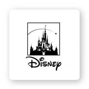
In the 2000s, Disney simplified its logo while retaining key elements. Today’s Disney logo often appears as just the wordmark—the name Disney in its distinctive, whimsical font, or occasionally with a stylized, minimalist version of the castle. This logo is instantly recognizable but doesn’t overwhelm with details.
Simplifying the logo reflected Disney’s desire to adapt to digital platforms while keeping the essence of the brand. The logo’s flexibility allows it to be used across various mediums, from movie posters to mobile apps, without losing its identity.
Key Takeaway: As brands enter the digital age, a simpler, adaptable logo is often more effective. This is particularly important for companies that plan to have an online presence or mobile applications. A versatile logo is easier to scale and display consistently across different platforms.
Timeless Appeal and Consistent Storytelling
Throughout its evolution, Disney’s logo has maintained its charm and appeal by focusing on a consistent theme—magic, wonder, and timeless storytelling. The logo’s evolution wasn’t a complete overhaul but a series of refinements that added depth and stayed aligned with Disney’s vision.
For business owners, consistency is key. A logo should adapt to new trends and mediums, but without losing its core identity. By staying true to your brand’s values, your logo can become a familiar symbol that customers trust over time.
Lessons for Business Logos
The Disney logo offers valuable insights into creating a brand symbol that grows alongside a business. Here’s what companies can learn from Disney’s journey:
Start Simple: Your logo doesn’t have to be complex from the start. Begin with a design that communicates your brand’s core values, just like Disney did with its original Mickey-inspired logo.
Add Personalization: Incorporating a personal touch, like Disney’s signature, can foster a deeper connection with your audience, especially if you’re a smaller business or if the founder’s story is central to the brand.
Evolve Thoughtfully: As your business grows, it’s natural to refresh your logo. Add elements that symbolize new offerings or achievements, similar to how Disney added the castle and stars.
Keep it Flexible: A logo should work across all platforms. Disney’s modern logo is simplified and adaptable, allowing it to look great on everything from billboards to smartphone screens. Choose a design that works well in both small and large formats.
Consistency is Key: Stay true to your brand’s story. Whether your brand revolves around joy, reliability, or innovation, make sure your logo embodies these values through every redesign
Final Thoughts: Building Your Own Iconic Logo
Creating a logo that stands the test of time requires vision, adaptability, and a deep understanding of what your brand represents. Disney’s logo evolution is a remarkable example of how thoughtful design can keep a brand relevant for generations. While your business may not have a castle or a famous signature to start with, taking cues from Disney’s approach to logo design can help you create a memorable, versatile, and enduring symbol for your brand.
In the end, a logo is more than just a mark—it’s a visual narrative of what your business stands for and where it’s headed. By keeping your logo aligned with your brand’s story, you can make it a powerful tool for connection and growth. Just as Disney has done for nearly a century, your logo can become a beacon that brings your unique brand story to life
A logo is a visual tool that you can leverage in all your marketing efforts. Whether it’s on your website, social media, or in promotional materials, your logo boosts your brand’s presence. With a powerful logo, every marketing piece you create adds to the recognition of your brand, making each dollar you spend on marketing more effective.
Fun Fact: Did you know that people remember images better than words? This is called the picture superiority effect, and it’s one reason logos can have such a lasting impact.


