- Our Services
Brand Identity
Website Design
Print Media
Brand Identity
Website Design
Print Media
Packaging Design
- Pricing
Brand Identity
Website Design
Print Media
Brand Identity
Website Design
Print Media
Packaging Design
- Portfolio
- About Us
- Our Team
- Our Reviews
- Blogs

How to Use Emblem Logos to Perfectly Capture Your Brand's Identity
Emblem logos hold a special place in the world of branding. With their distinct combination of symbols, text, and design elements encased within a single shape, they are designed to convey a cohesive, timeless representation of a brand’s identity. Used effectively, an emblem logo can communicate professionalism, tradition, and brand values, creating a lasting impression on audiences.
In this guide, we’ll explore how to design and use an emblem logo that reflects your brand’s unique identity, the key elements to include, and practical tips for making it versatile across different media.
1. Understand the Essence of an Emblem Logo
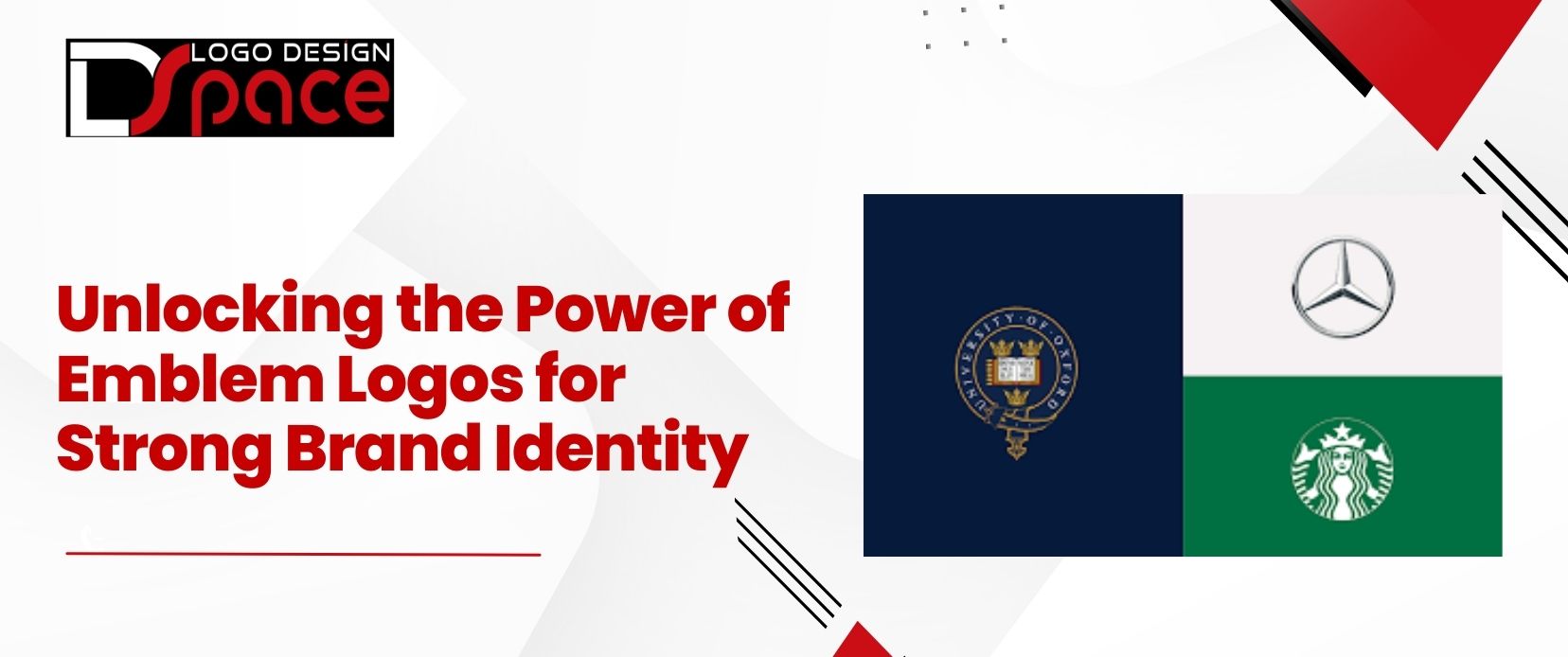
Emblem logos combine text and imagery within a defined shape—often a badge, crest, or shield—to form a unified symbol. Their design style conveys tradition and authority, making them popular with brands that aim to establish a sense of trust and lasting value. For this reason, emblem logos are frequently used by organizations such as schools, government agencies, and established corporations. Iconic brands like Harley-Davidson, Starbucks, and BMW have also used emblem logos to create instantly recognizable identities.
The strength of an emblem logo lies in its unified look, which communicates that all elements of the brand—its name, symbol, and values—are deeply interconnected. As a result, an emblem logo is especially suited to brands that want to portray a cohesive and enduring image.
2. Crafting an Emblem Logo That Reflects Your Brand Identity
To design an emblem logo that resonates with your brand’s personality, you’ll need to focus on these key elements:
Symbolism: Choose imagery or icons that reflect your industry, mission, or values. For example, if your brand is in the health industry, consider symbols like a heart or leaf to represent wellness and growth. If you’re designing for a tech brand, a gear or abstract design might work better.
Typography: The font style can significantly impact how people perceive your brand. A serif font, for example, can convey tradition and authority, while a sleek, sans-serif font can signal modernity and approachability. Ensure that your font choice aligns with the tone you want to set.
Color Palette: Your color choices should reinforce your brand identity. Bright, bold colors may suggest creativity and innovation, while more muted tones often convey sophistication and reliability. Stick with a cohesive color palette that aligns with your broader brand colors for a consistent look.
Shape and Structure: The outline or shape of an emblem (whether circular, shield-like, or angular) adds personality. Rounded shapes are often perceived as friendly and welcoming, while more angular or shield-like shapes may convey strength and authority. Choose a shape that aligns with your brand’s tone.
3. Prioritize Clarity and Simplicity

Since emblem logos often incorporate both text and graphic elements, simplicity is key. Make sure your logo is easy to read and recognize, even when scaled down. Clarity is especially important for emblem logos, which can easily become cluttered or difficult to decipher if too detailed.
Limit Text: If your brand name is long, consider using an abbreviation, acronym, or initials. This can prevent the logo from becoming too busy and help it retain readability.
Simplify Graphics: Avoid overly intricate graphics that may blur or lose clarity at smaller sizes. Opt for bold, clean lines to ensure the design stays sharp and recognizable.
4. Embrace Versatility in Design
Emblem logos are usually ideal for traditional applications like signage and business cards, but they can be challenging for smaller formats, such as social media profiles or mobile app icons. To maintain versatility:
Create a Simplified Version: Develop a secondary, simplified version of your emblem for applications where detail could be lost. For instance, use a standalone symbol or initials on smaller platforms, while reserving the full emblem for larger media.
Consider Responsive Design Options: Some brands adopt “responsive logos” that adapt based on the medium. You might use a more detailed emblem for your website but simplify it to a minimal, icon-like version for social media or other compact applications.
5. Ensure Consistency Across All Platforms

As a core component of your brand identity, your emblem logo should be consistent wherever it appears. To maximize brand recognition, use the same logo version, color scheme, and font on all platforms—whether it’s on digital platforms, business cards, packaging, or advertising.
Develop a Brand Style Guide: Creating a style guide that details logo usage, colors, typography, and layout preferences can help ensure that your emblem is used consistently across all media.
6. Test and Gather Feedback
Once your emblem logo is designed, it’s important to test it with your target audience. Share the design with focus groups or gather feedback online to gauge its appeal and readability. Use their insights to make any necessary adjustments, ensuring that your emblem logo represents your brand in the best way possible.
7. Integrate Your Emblem Logo Into Your Marketing Strategy
Emblem logos are highly versatile, so take advantage of their flexibility to enhance your marketing strategy. Use them in social media profiles, email signatures, product packaging, and branded merchandise. Emblem logos tend to perform well on printed materials and signage, making them a strong choice for storefronts, brochures, and event banners. by hiring a logo designer or a custom logo design agency, they will provide the best emblem logo for you. The cohesive, self-contained nature of an emblem logo makes it an ideal choice for cross-platform branding.
Final Thoughts

An emblem logo is more than just a symbol—it’s a powerful representation of your brand’s core identity. By thoughtfully selecting each design element—symbolism, typography, color, and structure—you can create an emblem that resonates with your target audience and communicates your brand values at a glance. Focus on simplicity, ensure versatility, and test your design to fine-tune it to your audience’s preferences. With a well-crafted emblem logo, your brand will be more memorable, recognizable, and relatable across all platforms.


