- Our Services
Brand Identity
Website Design
Print Media
Brand Identity
Website Design
Print Media
Packaging Design
- Pricing
Brand Identity
Website Design
Print Media
Brand Identity
Website Design
Print Media
Packaging Design
- Portfolio
- About Us
- Our Team
- Our Reviews
- Blogs
Netflix Logo History and Evolution: A Lesson in Modern Brand Design
The Netflix logo is a symbol of the streaming giant’s global success, instantly recognizable on screens everywhere. But Netflix’s logo wasn’t always the sleek design we know today. As the company transitioned from a DVD rental service to a leader in streaming, the Netflix logo evolved, adapting to the digital era and becoming an emblem of modern entertainment. For business owners and logo designers, the journey of the Netflix logo offers valuable insights into creating a logo that reflects change while staying true to its core identity.
The Early Days: The Original Netflix Logo (1997-2000)
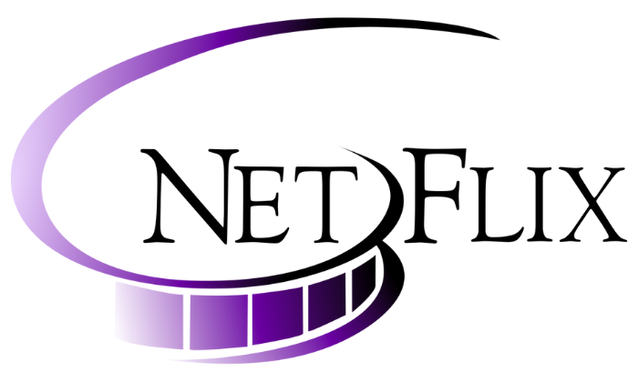
When Netflix first launched in 1997, it was a DVD rental service by mail. Its initial logo was simple, featuring “Netflix” in an old-style font with a film reel icon representing the company’s focus on movies. The font was serifed, with a shadow effect on the letters, which was a common design choice for logos in the late 90s.
This initial logo had a traditional feel, aligning with the idea of home entertainment and movie rentals. However, as Netflix prepared to shift to streaming in the early 2000s, this logo quickly became outdated, and the need for a more modern design became apparent.
Lesson for Businesses: A logo should reflect your business model. As Netflix’s services evolved, so did its logo, demonstrating the importance of updating branding to align with company direction. For new businesses, this means starting with a logo that suits the brand’s identity today but staying open to future changes.
The 2000s Makeover: Embracing the Internet (2000-2014)
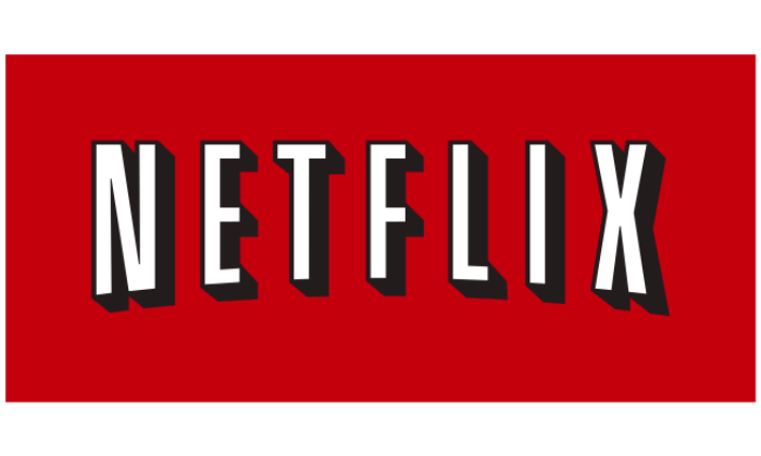
In 2000, Netflix adopted a new logo that featured the now-iconic wordmark in bold, red uppercase letters with a shadow effect. This logo was a dramatic departure from the original, dropping the film reel and opting for a minimalist design that could easily adapt to digital formats. The use of bright red was intentional, making the logo attention-grabbing on various digital interfaces.
This redesign aligned perfectly with Netflix’s transition to streaming, creating a stronger, more modern look. The red and black color scheme became central to Netflix’s brand identity, symbolizing boldness and innovation.
Lesson for Businesses: When designing a logo for digital platforms, simplicity and bold colors can be highly effective. Netflix’s rebranding to a modern, streamlined look showed that minimalism can be powerful and memorable, especially when aiming to capture the attention of online viewers.
The Transformation: The Minimalist Logo (2014-Present)
In 2014, Netflix further refined its logo by removing the shadow effect and opting for a flat design in a striking red wordmark. This updated look was perfectly suited for mobile and digital screens, aligning with the flat design trend that had taken hold in tech branding. The wordmark, with its simple red-on-white or white-on-black versions, is easily readable on any screen size and resolution.
This new version also helped Netflix establish a global identity, looking equally appealing on mobile screens, TVs, and printed material. It was also versatile enough for a broader array of brand uses, from app icons to banners.
Lesson for Businesses: Adapting to design trends while staying true to core brand elements is key. Netflix’s minimalist approach shows how simplifying a logo can make it more versatile for modern media, without losing its recognizability.
The Iconic ‘N’: A Sub-Logo for the Digital Age (2016-Present)
In 2016, Netflix introduced a stylized “N” as a sub-logo, often used as the app icon on mobile devices and in promotional materials. The “N” logo was designed with a unique ribbon-like style, making it distinct while still being recognizable as part of the Netflix brand. This sub-logo was a savvy move, as the full Netflix wordmark wasn’t always practical for small digital spaces.
The “N” has since become an iconic symbol of Netflix’s brand, adding flexibility to their logo design. It appears in red, black, and white versions, allowing Netflix to create a consistent look across all digital and physical touchpoints.
Lesson for Businesses: Sub-logos can add flexibility and brand recognition. A secondary logo or icon that reflects the main brand can be especially useful for businesses with apps, social media, or e-commerce sites where space is limited.
Why Netflix’s Logo Evolution Matters for Modern Branding
The journey of the Netflix logo is more than just a visual transformation—it’s a case study in aligning design with business growth and audience expectations. Here’s how Netflix’s logo evolution offers practical lessons for anyone creating a logo for their business:
Adapting to Change: Netflix’s logo shows how a business can successfully adapt to new mediums and customer needs. The initial logo was created for physical movie rentals, but as Netflix transitioned to streaming, the design evolved to match the digital landscape.
Keeping It Simple: The clean, minimalist design of the current Netflix logo is timeless, and its versatility has allowed it to remain relevant for nearly a decade. Simple logos are easier to recognize and adapt, making them more effective in today’s fast-paced, digital world.
Creating Brand Flexibility: The introduction of the “N” sub-logo provided Netflix with a flexible branding tool, perfect for mobile app icons, social media, and smaller display formats. A sub-logo or icon can be a valuable addition to any brand, particularly for businesses planning a strong online or mobile presence.
Staying consistent with Colors and Fonts: Netflix’s use of red and black across all logo versions has helped build strong brand recognition. Consistency with colors and fonts is essential to build a memorable brand image. A logo should be unique but consistent across every channel, whether digital or print.
Final Thoughts: Building Your Own Lasting Logo
The Netflix logo journey shows that even iconic brands need to adapt. Today’s digital audience appreciates a simple, modern, and versatile design. For business owners, whether a startup or an established company, keeping your logo aligned with your brand’s identity and growth plans is essential. Don’t be afraid to evolve the design as your business changes, but make sure any updates stay true to your brand’s value
The Netflix logo is a reminder that a logo should be more than just a mark—it’s an experience. From creating a connection to symbolizing innovation, a logo can be a powerful tool for communicating what your brand stands for. By following Netflix’s example, your logo can be a lasting, adaptable, and recognizable symbol that grows with your business, capturing the attention and trust of your audience for years to come. For Logo Design Services In USA click the link below

