- Our Services
Brand Identity
Website Design
Print Media
Brand Identity
Website Design
Print Media
Packaging Design
- Pricing
Brand Identity
Website Design
Print Media
Brand Identity
Website Design
Print Media
Packaging Design
- Portfolio
- About Us
- Our Team
- Our Reviews
- Blogs

Twitter Logo History, Evolution, and Symbolism: A Journey of Design
Logos are more than just visuals—they are symbols of a brand’s identity, mission, and evolution. Among the most iconic in the digital age is Twitter’s logo. From its text-based beginnings to the beloved “Larry the Bird” and the recent transformation into “X,” the Twitter logo is a case study in strategic branding and design adaptability.
This blog explores the history, evolution, and symbolism of the Twitter logo, offering lessons for businesses and designers seeking to create or revamp their visual identities.
The Origins of the Twitter Logo
Early Days: Twitter’s First Visual Identity

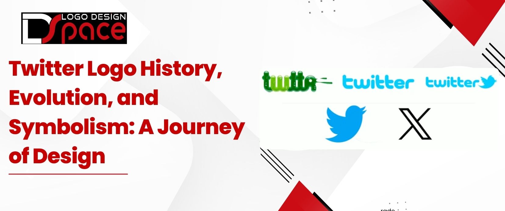
When Twitter launched in 2006, its original logo was a simple wordmark in a sans-serif typeface. This minimalist approach reflected the platform’s straightforward purpose: brief, concise communication. While functional, the logo lacked the personality and memorability necessary for a growing global platform.
As Twitter gained traction, the need for a visual symbol that encapsulated its essence became clear, leading to the creation of one of the most recognizable logos in tech history.
The Creation of Larry the Bird

In 2010, Twitter introduced the bird logo, affectionately named “Larry.” Inspired by basketball legend Larry Bird, this playful yet meaningful design symbolized the brand’s mission of freedom, communication, and connectivity. Illustrator Simon Oxley initially created the bird design, which Twitter’s team later refined to better align with the brand’s vision.
The Evolution of the Twitter Logo
2010 Redesign: A Streamlined Larry

The first major update to Larry the Bird came in 2010. This redesign simplified the bird, removing unnecessary details and making the icon scalable across digital platforms. This marked Twitter’s shift from a text-heavy identity to a logo-driven one, emphasizing visual storytelling.
2012 Redesign: Minimalism and Precision

In 2012, Twitter fully embraced minimalism, creating a sleek, geometric Larry composed entirely of overlapping circles. This design reinforced Twitter’s values of simplicity, clarity, and accessibility. By eliminating text and focusing solely on the bird, the platform cemented its global recognition.
2023: From Larry the Bird to "X"

Under Elon Musk’s leadership, Twitter rebranded as “X” in 2023, retiring Larry the Bird. The new logo—a bold, minimalist “X”—represented a significant shift in the platform’s branding strategy, aiming to reposition Twitter as a broader tech ecosystem.
While the rebranding was polarizing, it highlighted the importance of aligning a logo with a company’s evolving mission. Larry’s departure marked the end of an era, but it also opened the door for a new chapter in Twitter’s story.
Decoding the Symbolism of the Twitter Logo
Why the Bird?
The bird symbolized freedom, communication, and global connectivity—values central to Twitter’s identity. This universal imagery resonated with users worldwide, transcending cultural and linguistic barriers.
Geometry and Timeless Design
The 2012 Larry design’s use of overlapping circles reflected balance, harmony, and adaptability. These geometric principles not only enhanced the logo’s aesthetic but also ensured it remained versatile and timeless.
Adaptability Through Change
The Twitter logo’s journey—from text-based origins to Larry and now “X”—is a masterclass in balancing tradition and innovation. Each iteration reflected the platform’s growth while staying true to its essence, offering valuable lessons for businesses navigating rebranding.
Key Lessons for Logo Design
1.Simplicity is Key
Twitter’s transition to Larry and later to “X” underscores the power of minimalism. Simple, clean logos are easier to remember, scalable, and adaptable to various mediums.
2.Reflect Brand Values
Larry the Bird encapsulated Twitter’s mission of fostering open communication, while the shift to “X” signaled the company’s broader ambitions. A logo should evolve alongside the brand it represents.
3.Embrace Change Strategically
Rebranding can be controversial, as seen with Twitter’s 2023 transformation. However, aligning a logo with the company’s vision is crucial for long-term success.
Conclusion
The Twitter logo’s journey, from a humble text-based design to the iconic Larry the Bird and finally to “X,” reflects the platform’s growth, adaptability, and willingness to embrace change. For businesses and designers, this evolution serves as an inspiration to create logos that not only capture the brand’s essence but also adapt to changing landscapes.
Are you ready to create a logo as iconic and timeless as Twitter’s? Let our expert design team help you bring your vision to life!. By hiring a professional logo designer or a graphic design agency ,you will have a tremendous logo design for your company .

